Custom charts let you control both the data loaded into a panel and how it’s visualized. This tutorial walks you through logging data, building a query, customizing the chart’s Vega specification, and saving the result for reuse. It’s intended for users who want to go beyond the default chart types and tailor visualizations to specific data. By the end of this tutorial, you’ll have a working custom chart in your project that you can save as a preset and a bonus composite histogram you can adapt to your own data.Documentation Index
Fetch the complete documentation index at: https://wb-21fd5541-docs-2632.mintlify.app/llms.txt
Use this file to discover all available pages before exploring further.
Log data to W&B
Before you can visualize anything in a custom chart, your run needs to log the data you want to display. Use wandb.Run.config for single points set at the beginning of training, like hyperparameters. Use wandb.Run.log() for multiple points over time, and log custom 2D arrays withwandb.Table(). We recommend logging up to 10,000 data points per logged key.
Create a query
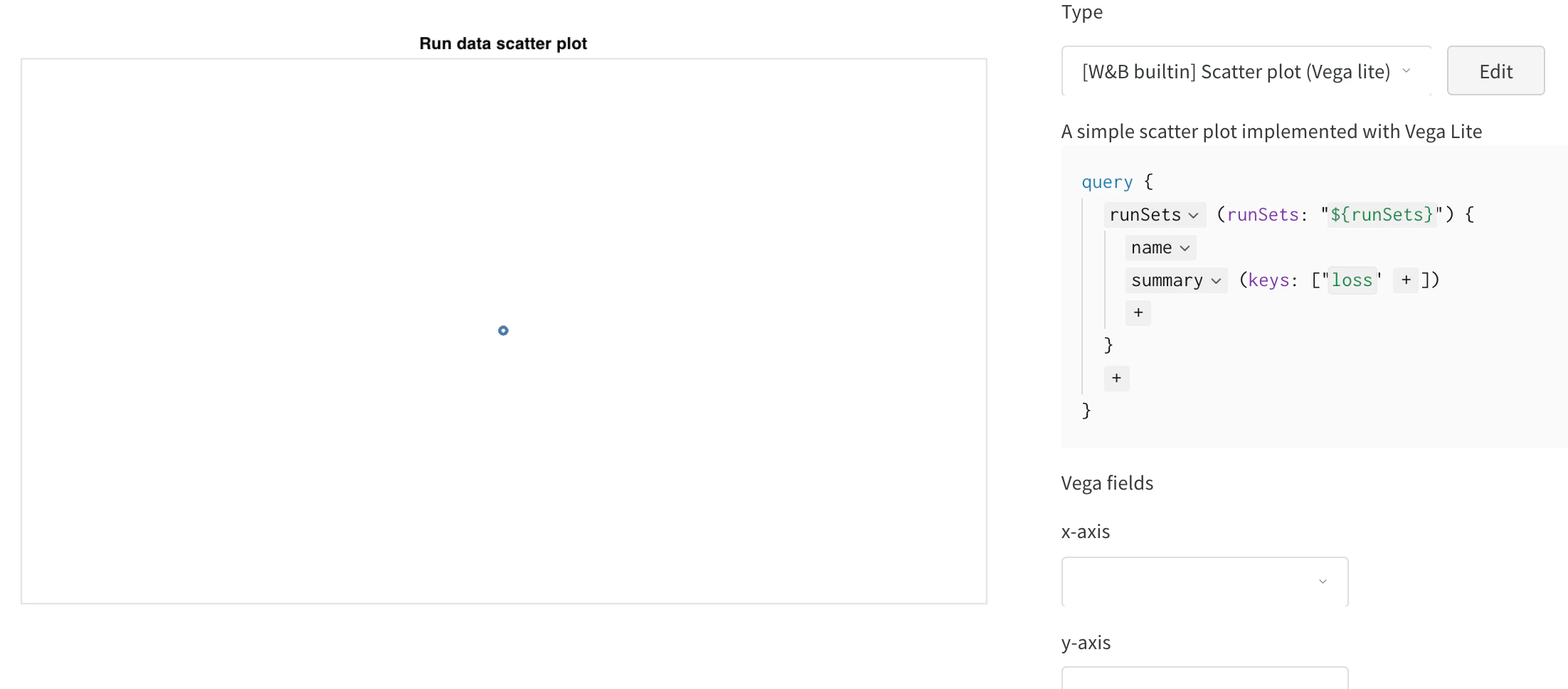
A query tells the custom chart which logged data to load. After you’ve logged data to visualize, go to your project page and click the+ button to add a new panel, then select Custom Chart. You can follow along in the custom charts demo workspace.
Add a query
- Click
summaryand selecthistoryTableto set up a new query pulling data from the run history. - Type in the key where you logged the
wandb.Table(). In the previous code snippet, it wascustom_data_table. In the example notebook, the keys arepr_curveandroc_curve. For more information aboutsummaryTable,historyTable, andtableKey, see Build the GraphQL query.
Set Vega fields
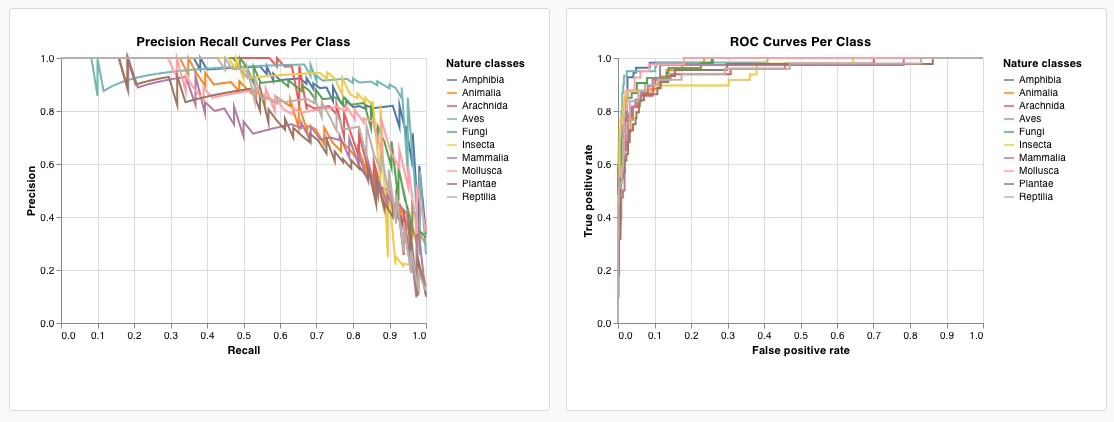
With the query in place, you can map your logged columns to the chart’s visual encodings using the Vega fields dropdown menus: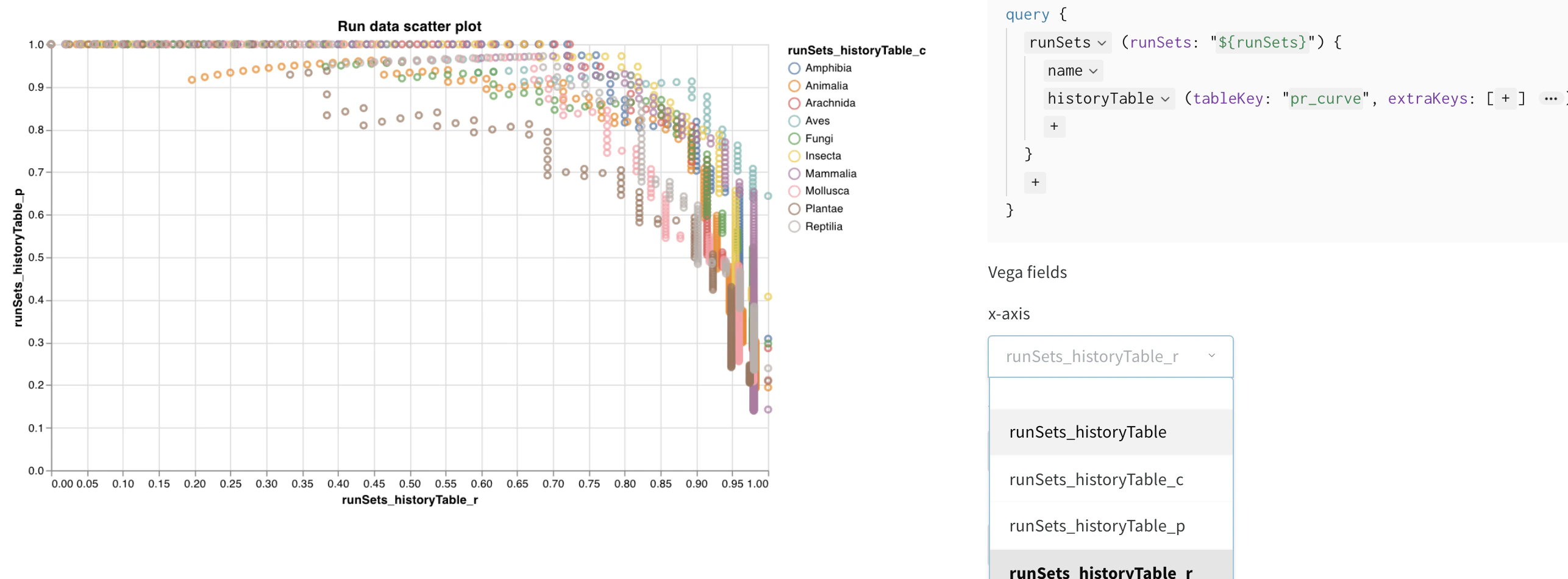
- x-axis: runSets_historyTable_r (recall)
- y-axis: runSets_historyTable_p (precision)
- color: runSets_historyTable_c (class label)
Customize the chart
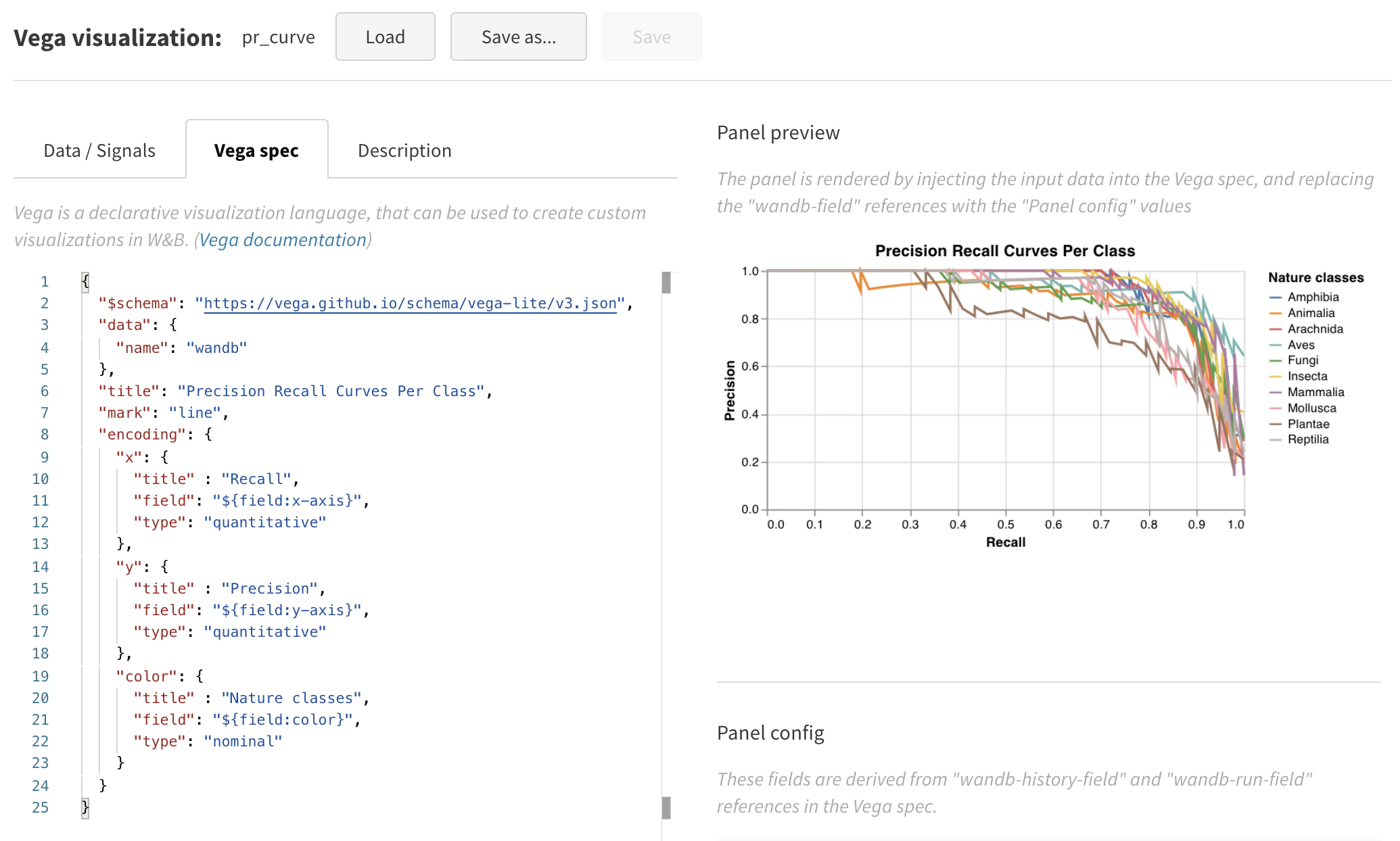
The default visualization is a good starting point, but you can edit the Vega spec to change the chart type, add titles, and refine the appearance. To switch from a scatter plot to a line plot, click Edit to change the Vega spec for this built-in chart. Follow along in the custom charts demo workspace.
- Add titles for the plot, legend, x-axis, and y-axis (set “title” for each field).
- Change the value of “mark” from “point” to “line”.
- Remove the unused “size” field.
Bonus: composite histograms
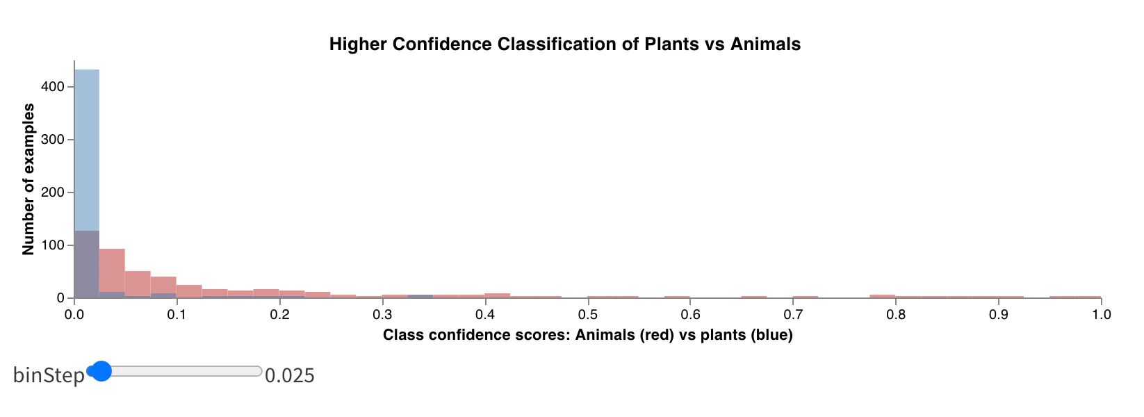
This section shows how to build a more advanced custom chart, a composite histogram that overlays two distributions in the same view, to demonstrate what’s possible after you’re comfortable editing the Vega spec. Histograms can visualize numerical distributions to help you understand larger datasets. Composite histograms show multiple distributions across the same bins, letting you compare two or more metrics across different models or across different classes within your model. For a semantic segmentation model detecting objects in driving scenes, you might compare the effectiveness of optimizing for accuracy versus Intersection over Union (IoU), or you might want to know how well different models detect cars (large, common regions in the data) versus traffic signs (much smaller, less common regions). In the demo Colab, you can compare the confidence scores for two of the ten classes of living things.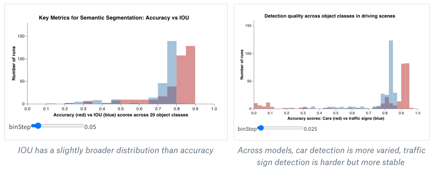
- Create a new custom chart panel in your workspace or report (by adding a Custom Chart visualization). Click Edit in the top right to modify the Vega spec starting from any built-in panel type.
- Replace that built-in Vega spec with the starter code for a composite histogram in Vega. You can modify the main title, axis titles, input domain, and any other details directly in this Vega spec using Vega syntax. For example, you can change the colors or add a third histogram.
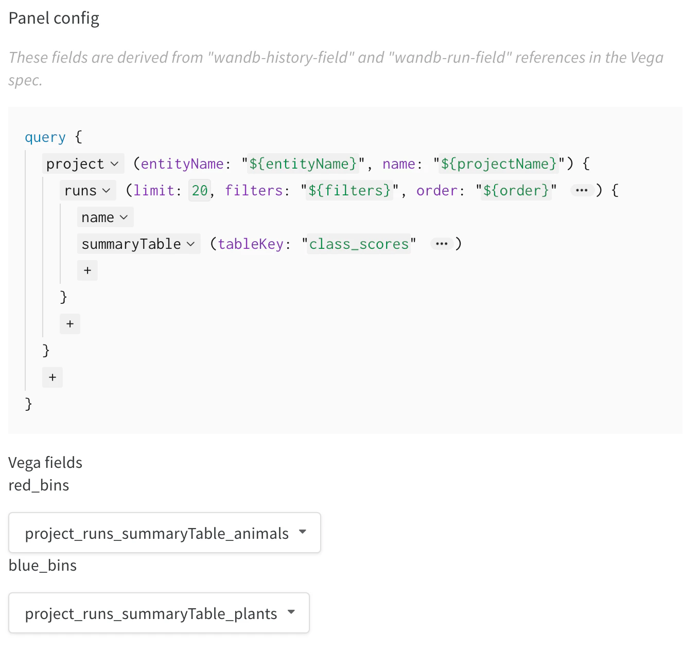
- Modify the query in the right panel to load the correct data from your wandb logs. Add the field
summaryTableand set the correspondingtableKeytoclass_scoresto fetch thewandb.Tablelogged by your run. This lets you populate the two histogram bin sets (red_binsandblue_bins) through the dropdown menus with the columns of thewandb.Tablelogged asclass_scores. For example, you can choose theanimalclass prediction scores for the red bins andplantfor the blue bins. - You can keep making changes to the Vega spec and query until the plot you see in the preview rendering matches what you want. After you’re done, click Save as in the top and give your custom plot a name so you can reuse it. Then click Apply from panel library to finish your plot.